Specify can leverage existing tools (Notion, Confluence, Slite) to make them dynamic and connect them to a source of truth. As a result, it helps users make the most of their stack when documenting design systems instead of relying on static solutions (updating frames/text manually in Figma) or paying for additional apps like Zeroheight.
Notion is the #2 tool in the design stack in 2022 (just after Figma) — this trend was also observed in the survey we sent before working on this project (see page 10), as well as its predominant usage by our users and qualified leads.
Company
Specify
Period
April to Nov. 2022
Space
Design Operations
Platforms
Web
Key Deliverables
User flows, Mockups, Prototypes, Animations, Code
95%
of paying users had a try to Notion as Destination since its release
72%
of paying users are still using the feature 3 months after its release
Opportunities
Here are the main opportunities we detected where the ratio reward/risk was balanced enough for this feature to be interesting for us to work on.
Boost our acquisition and conversion rate
This new destination will help us attract new users, as we will answer another problem they have while working on their design system.
Reduce time before aha-moment
Designers will not absolutely need help from developers to extract and update their token table inside Notion.
Improve retention
As teams will use Specify for doing two jobs automatically: the implementation part and the documentation part. Moreover, designers will also be able to use Notion to create press kits and stop wasting time on updating assets manually.
Design work
How we managed to build this feature and achieved these results
Research
Personal exploration
The following day Notion was releasing its API in public beta (I was so excited about this release). I extracted all design tokens from a Figma file with Specify Design API and put them in a Notion Database, and I created two proof of concepts:
Notion Integration: allowing users to sync their design tokens from Specify (previously connected to Figma) to a Notion Database
Design Tokens Cover API: allowing users to get a custom image of their design tokens in a Notion Database, made with Sharp.js
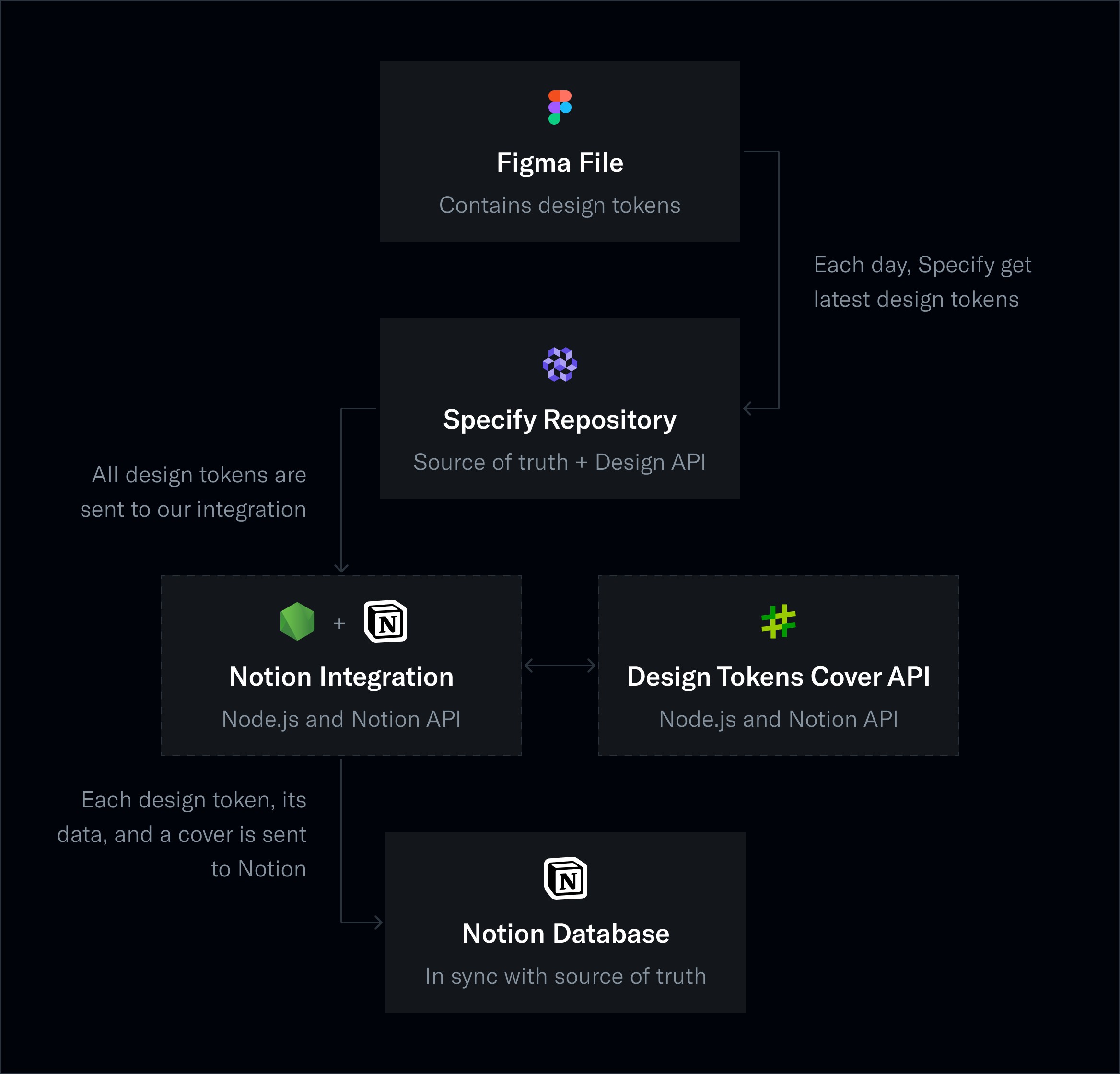
I tweeted about it, and it got some reactions in the design system and Notion community (8k+ impressions). Specify observed a 6% increase in new users compared to the previous month. This personal exploration provided a first insight to Specify audience’s interest in automating design system documentation.
Survey
We were looking for insights regarding knowledge bases and design system document tools: users, usages, tools, frequency of updates, etc. So we sent a Maze survey to our paying users and leads and solicited several communities on Slack and Twitter dedicated to the design system.
Specify Paying Users and qualified leads using a documentation tool
Design Systems (Worldwide) Slack: 23 000 members
Design Systems Twitter Community: 5 000 members
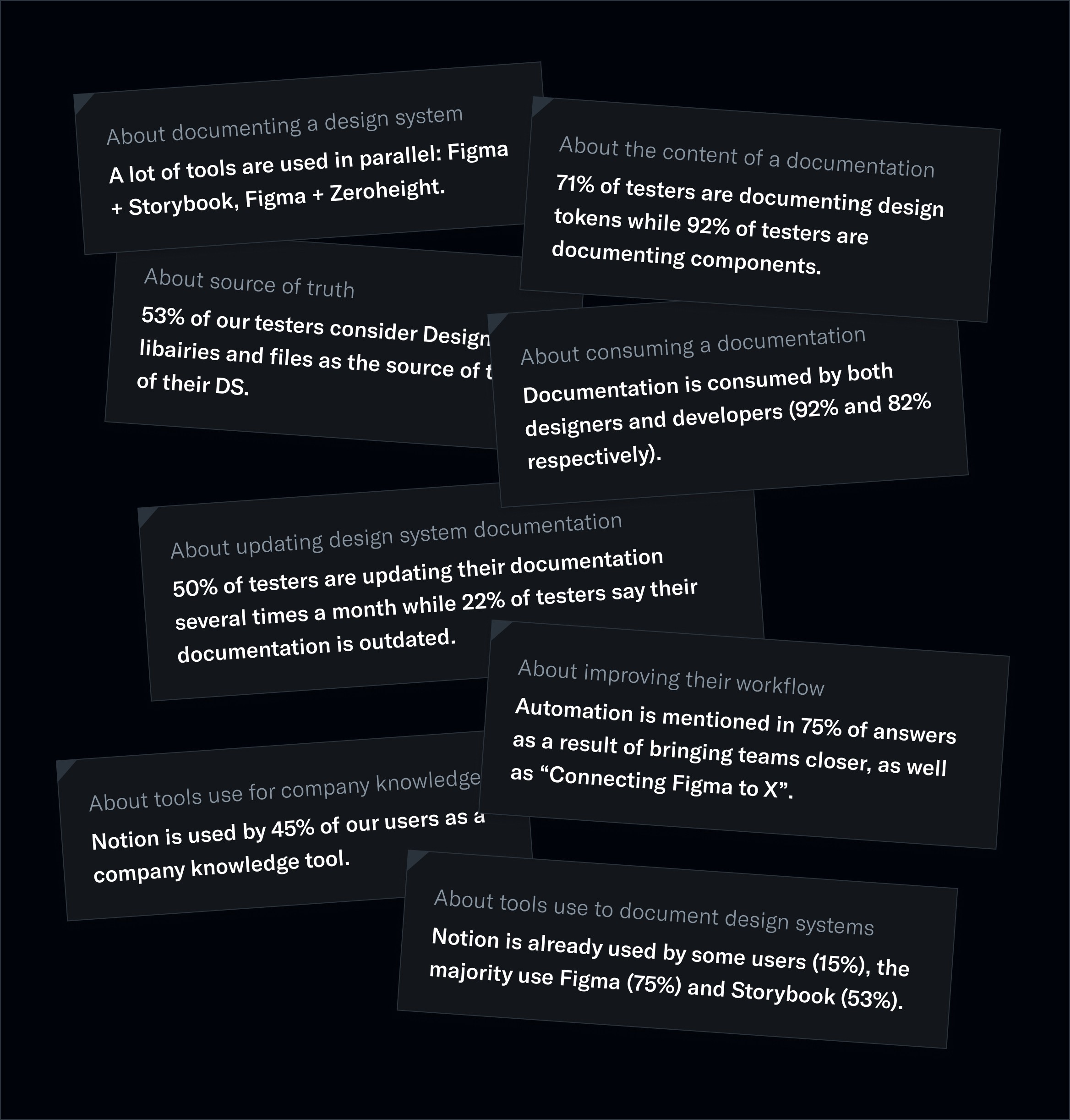
This survey initiated the Specify Beta Program with participants who want to test our upcoming features and participate in the conversation while we are building them. As a result, 30 testers joined this program after the survey.
Shaping
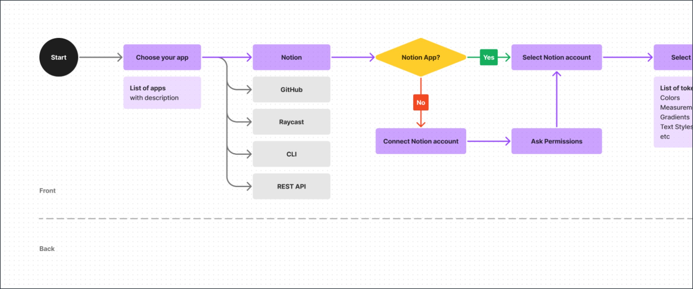
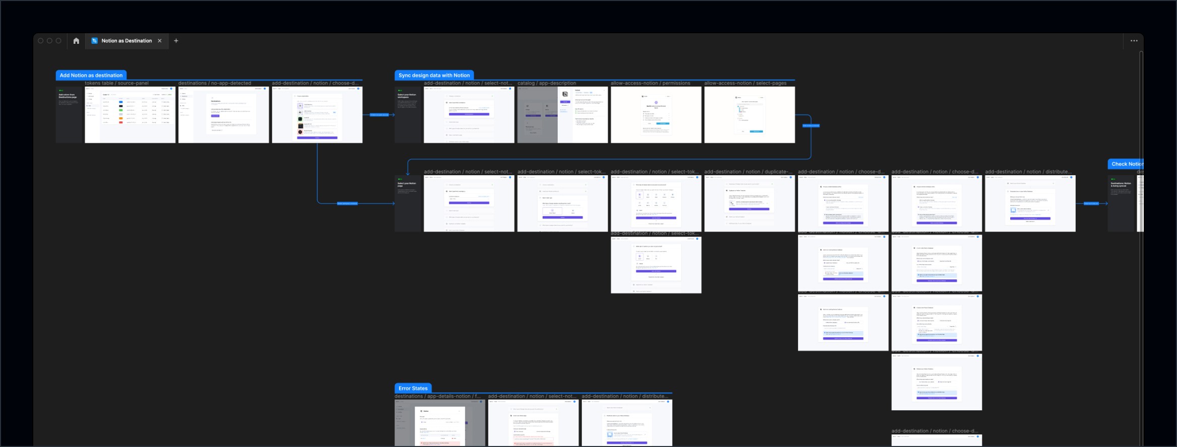
Pitch + Userflows
Before diving into the design work, we shaped with Maud (Product Manager) a first version of the user flows, wrote a pitch, and de-risked it with developers.
De-risk and rabbit holes
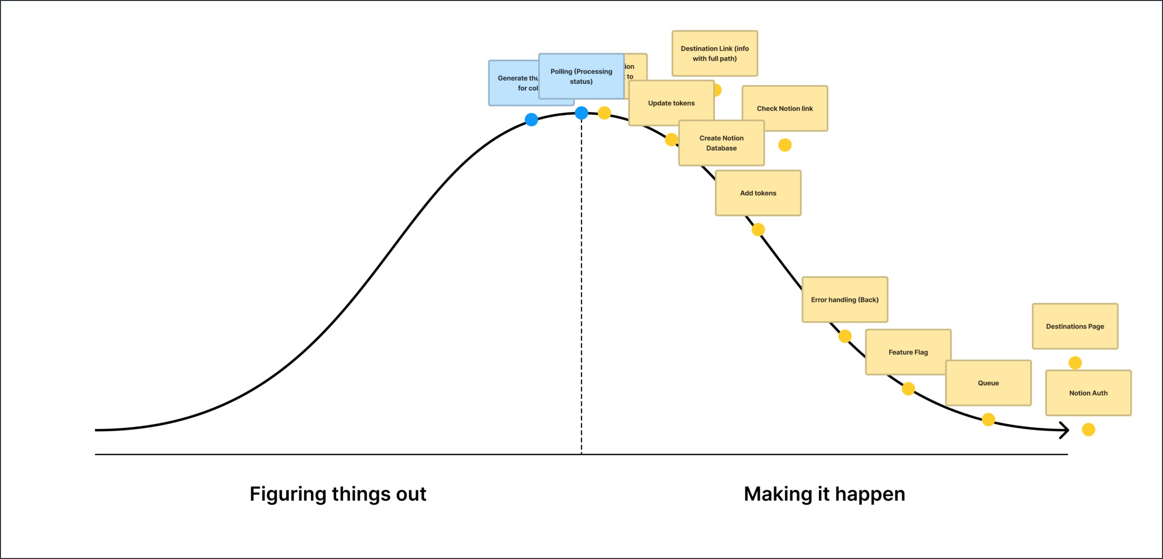
By having several discussions with engineers and providing time for them to explore the Notion API possibilities, we “de-risked” this project by ensuring we reduced as many gray zones as possible.
In addition to answering all these questions and rabbit holes to de-risk this project, we sat down with engineers, broke this project into pieces, and asked them about their confidence levels.
Then, during the project, while they were figuring things out, they progressively moved each piece to the right as their level of confidence increased.
Building
First prototype
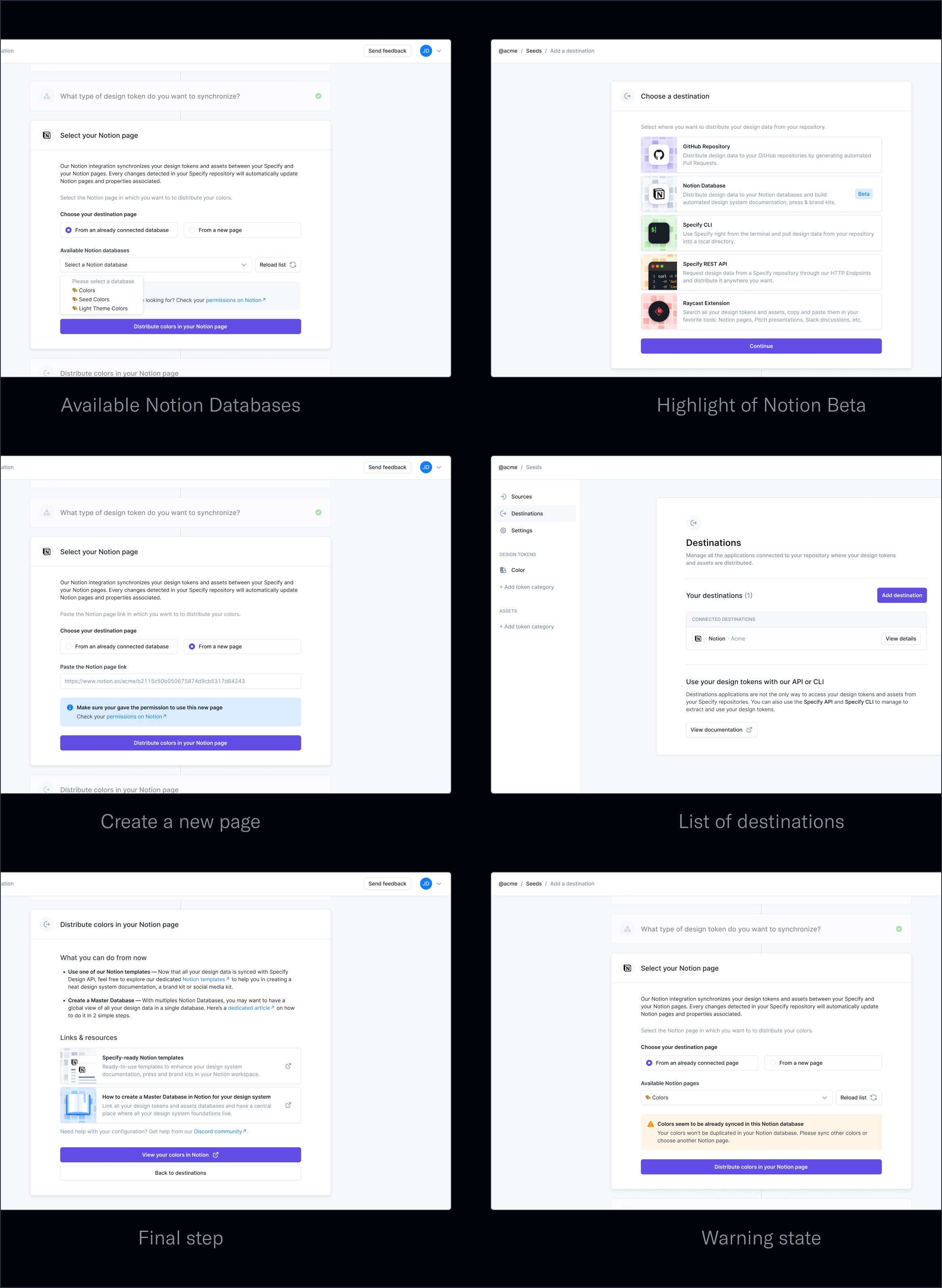
I designed the first concept experience in the first week in Figma based on the user flow we previously agreed on.
I made sure to use our design components, provided a first example of what the copy should look like, and highlighted the areas where I needed some clarification and where the usability test should focus.
Usability testing
We submitted the first version of this new feature to our 30 beta testers through a Maze survey and got 15 answers. Users loved that we tackled another pillar of design systems with the documentation, and they are enthusiastic about it.
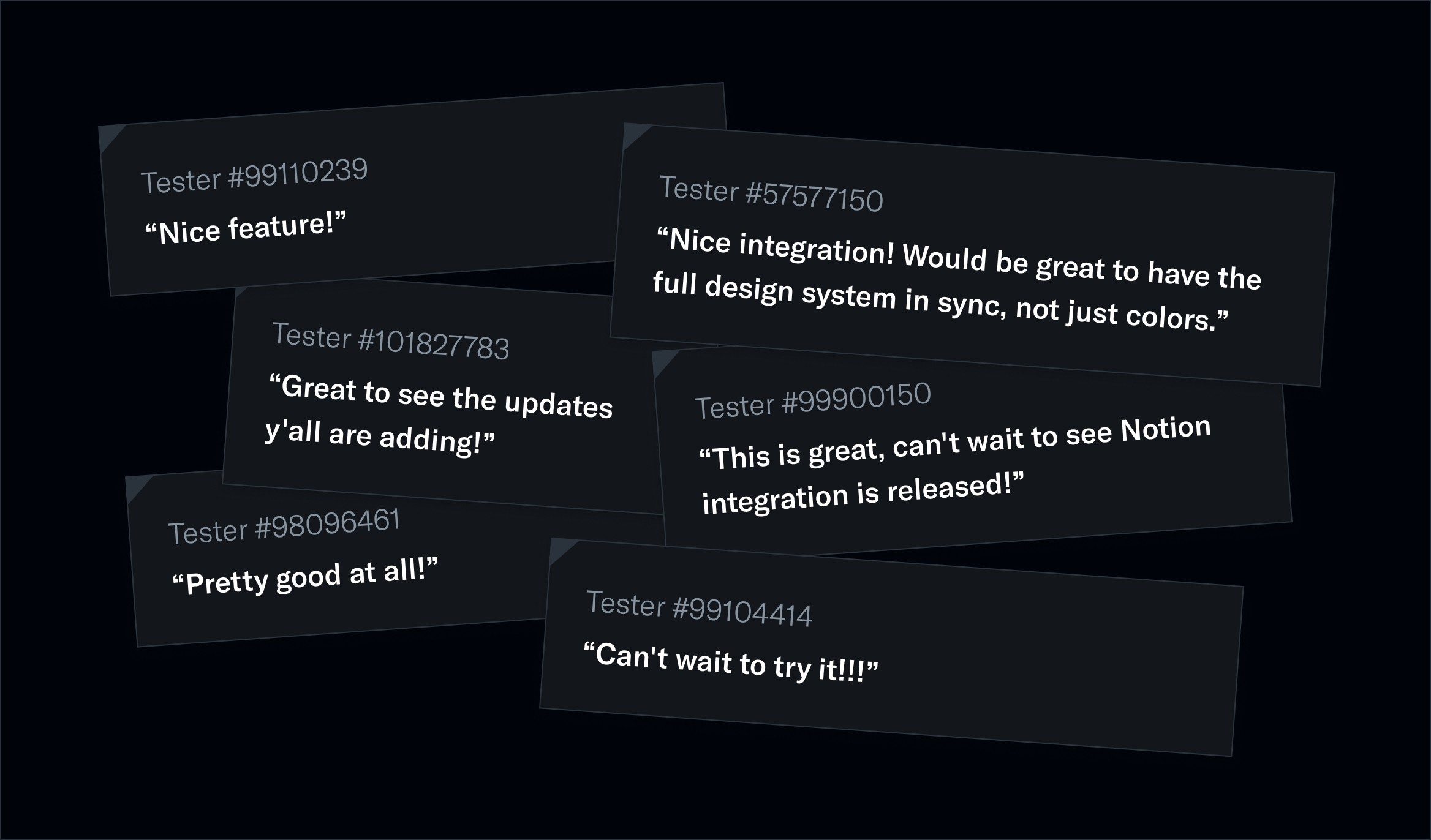
We learned that a Notion template would be appreciated, as users don’t want to spend extra time configuring their Notion Databases. Also, the “Select your Notion page” was tricky for some users. They need extra information to know what they are about to do.
Here are the scores we get: 92.5% success rate, 4.6/5 average rating, 1.6% bouncing rate
Improvements
Based on this feedback, we were able to improve steps where we had some hesitations with much more confidence:
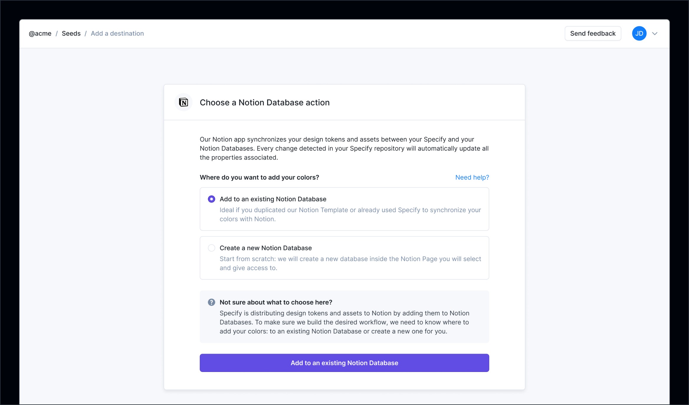
We created a Notion template with several views tailored to fit user needs when comparing tokens between light and dark modes, global vs. alias tokens, and groups.
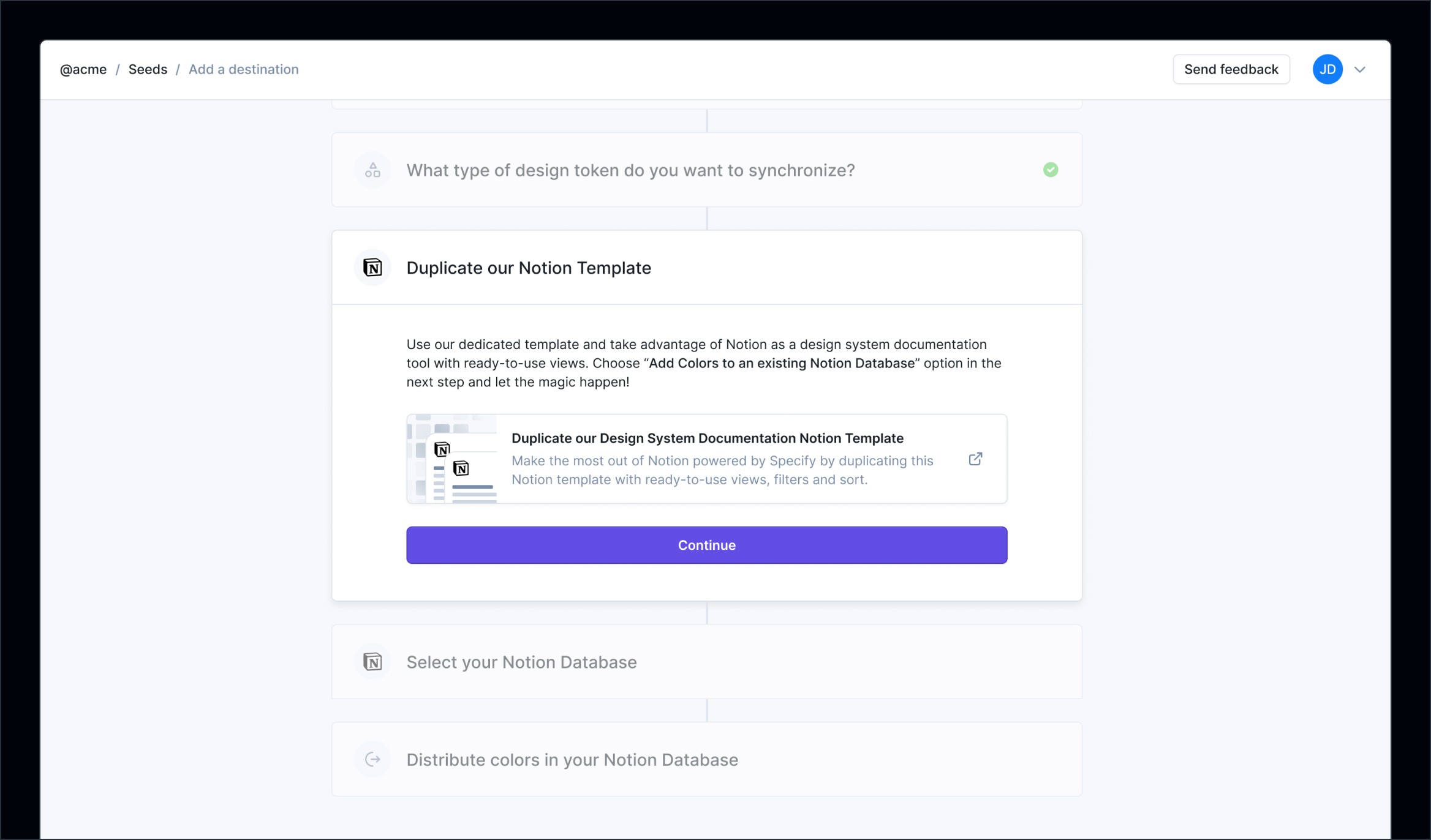
We added information inside each option and a helper callout to provide more guidance to users, and a “Need help” button, allowing them to use Intercom if needed.
Distribution
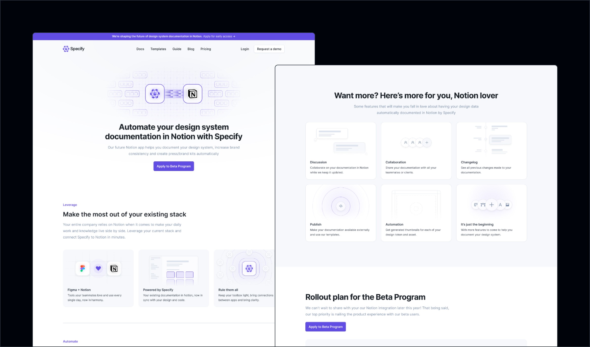
We created with Nathanaël (Front-End Engineer) a dedicated landing page on our website to promote the Notion as Destination beta feature.
With also promote it through our principal channels: our changelog (page + email) and with a Twitter thread.
See it live
Want to check out the final result? Here you go:
Outcomes
Key results we got a month after the release
95%
of paying users had a try to Notion as Destination since its release
72%
of paying users are still using the feature 3 months after its release
19%
of new destinations created are Notion Databases on average since the feature release
+9%
Each month, more users create Notion Databases with Specify
Credits
Thanks to this incredible team we exceeded expectations, S/O to them
Product Management
Maud Miguet
Design
Yann-Edern Gillet
3D + Motion
Thibaut Crepelle
Copywriting
Louis Chenais
Implementation
Allan Michay Mohamed Khalil Elloumi Nathanaël Labreuil
API & Infrastructure
Antoine Moreaux Nicolas André
Read other case studies
Learn more about my work with this selection:


