Under the hood, Specify requires users to provide configuration files to transform their design data (colors, text styles, icons, etc.): changing the case. adding suffixes or prefixes. converting values, creating files in the right place with the correct name.
To be validated, these configuration files need to respect a specific structure. We improved our Command Line Interface (CLI) to provide meaningful feedback with hints, warnings, and error messages.
Company
Specify
Period
March to April 2022
Space
Design Operations
Platforms
Command Line Interface
Key Deliverables
Mockups, Prototypes
+53%
Personal Access Token created to authenticate while pulling tokens from their Specify repositories.
+36%
Successful extractions — when a design token has been pulled from a Specify repository.
Opportunities
Here are the main opportunities we detected where the ratio reward/risk was balanced enough for this feature to be interesting for us to work on.
Improve activation
Our users found it difficult to understand how to use configuration rules and use Specify without seeking assistance.
Since there was no live feedback while building their configuration for Specify, users were not able to take advantage of helpful hints, warnings and error messages. Without a proper configuration, users will not be able to use Specify effectively.
Design work
How we managed to build this feature and achieved these results
Research
Designing for terminals
I researched CLI patterns, best-in-class examples, Amanda Pinsker's Config talk about GitHub CLI, read Command Line Interface Guidelines.
I also paid closer attention to the CLI tools I was already using and created a moodboard with examples of NPM, Yarn, GitHub, JEST, Stripe, Squoosh, and Typescript Tests.
Stack
We list what we need with engineers and choose to use Ink and Chalk for this project to achieve these desired UI results:
indent information on multiple levels with progress bars for each
apply color and background color / highlight to text
display progress bars
Shaping
Error list
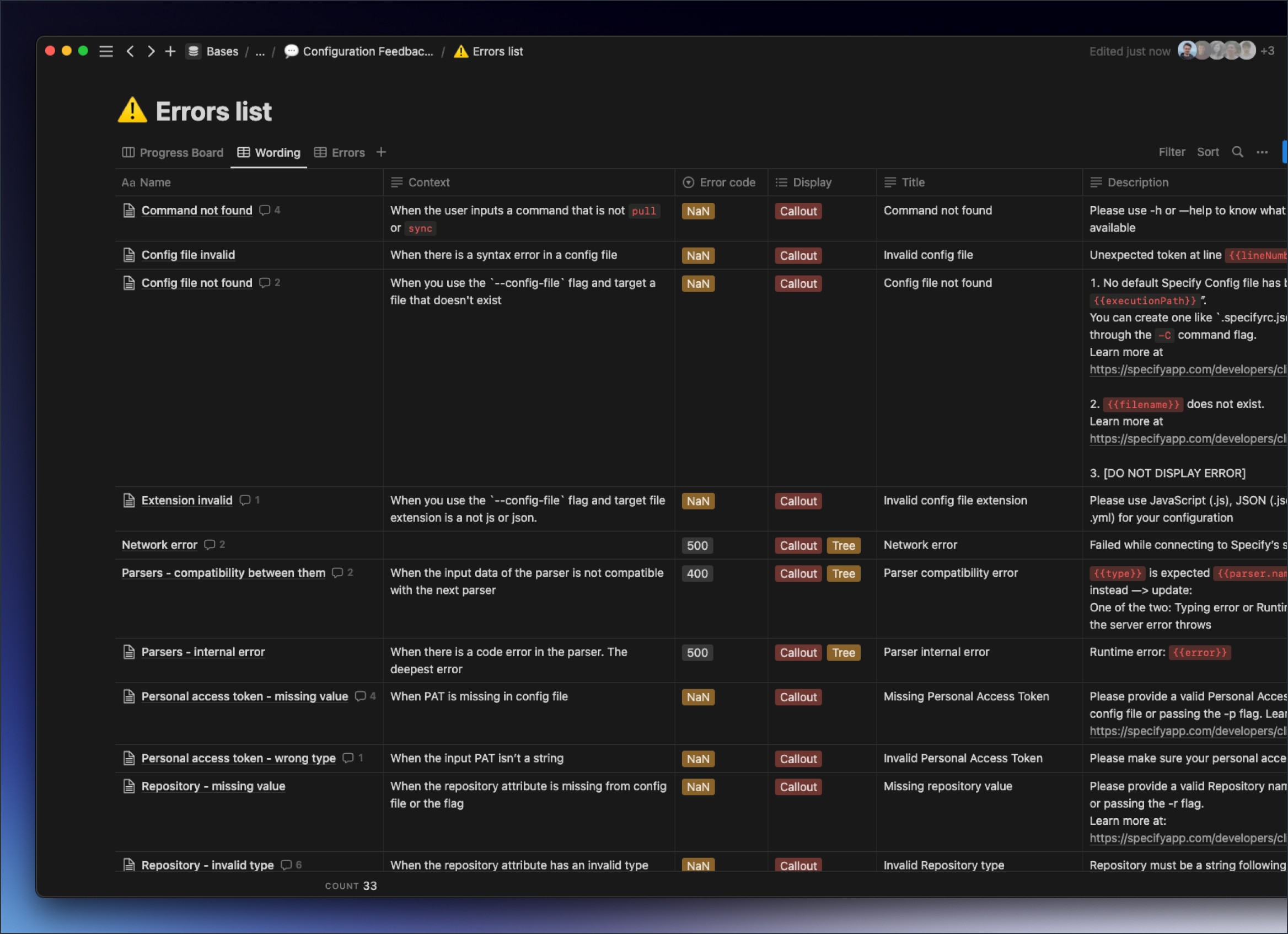
I mapped all possible errors with Nicolas and Khalil (engineers) in a Notion table while Maud (PM) gathered data for each. When building our new CLI, we turned this list into a Kanban board to track our progress.
Later, when I jumped into Figma, this exercise allowed me to group errors and apply the same patterns regarding provided UI and messages.
Building
Colors
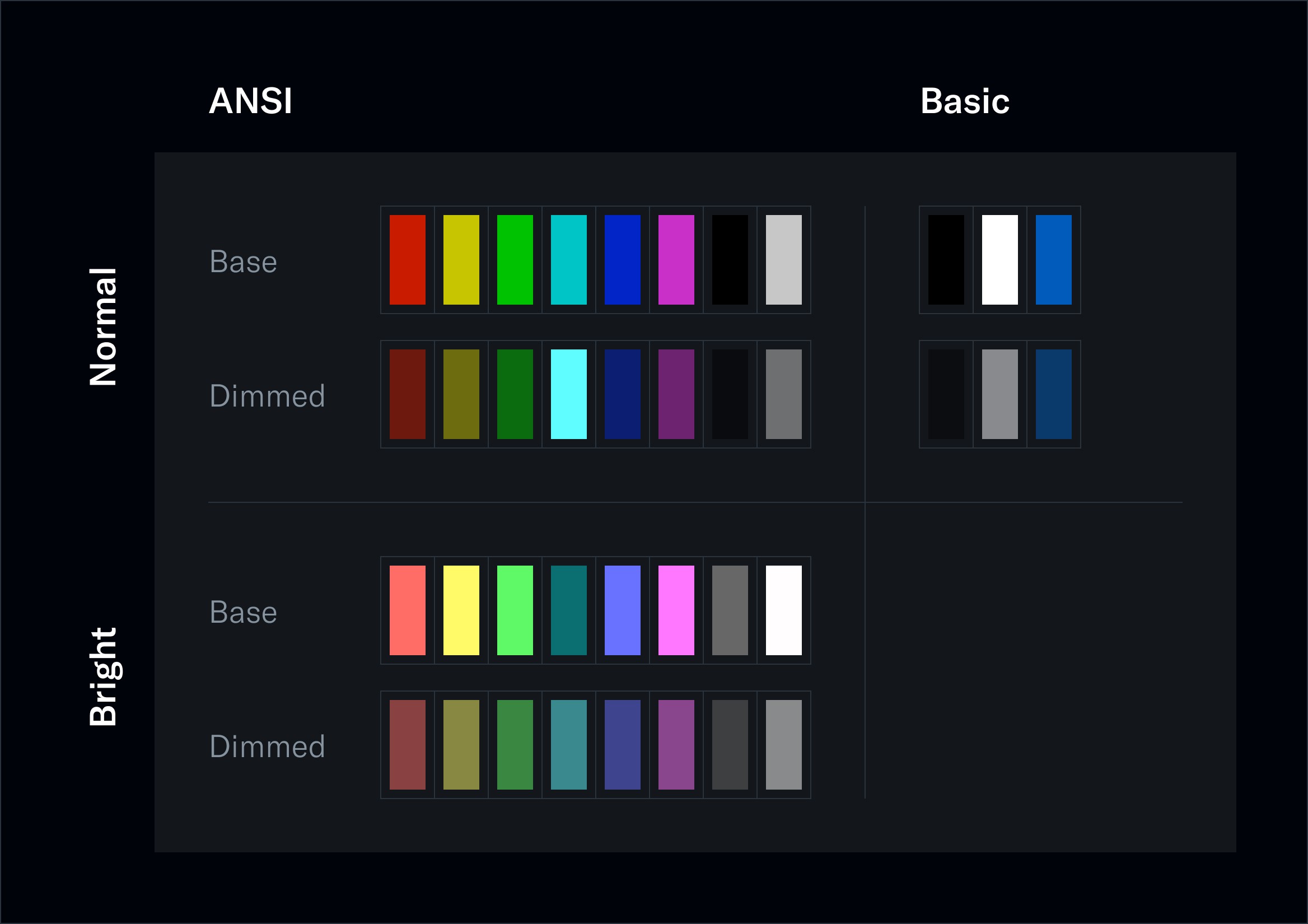
After digging into American National Standards Institute (ANSI) colors, I realized I would have to deal with a rigorous amount of shades, 38 precisely:
16 ANSI colors (black, red, green, yellow, blue, magenta, cyan) with a normal and bright version for each one
and 3 “basic” ones for the foreground, background, and links — note that there is no user preference detection regarding light or dark themes affecting the background and foreground colors here.
Each of these 19 colors has a dimmed variation (around 50% opacity) — leading to a total of 38 colors.
Iconography
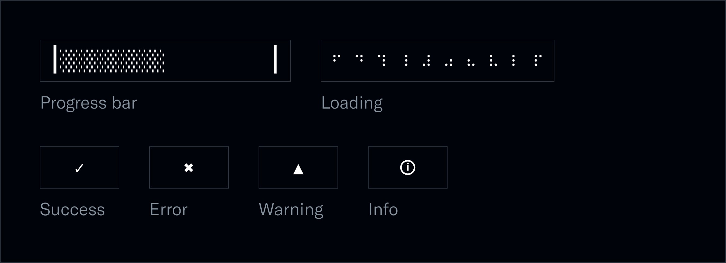
Then, I started exploring UTF-8 possibilities and characters available for progress bars, indents, and feedback icons, like a checkmark for successes, an exclamation point for warnings, or a cross for errors, as icons can't be displayed on terminals. Finally, I ended up with enough symbols to cover all use cases.
Typography
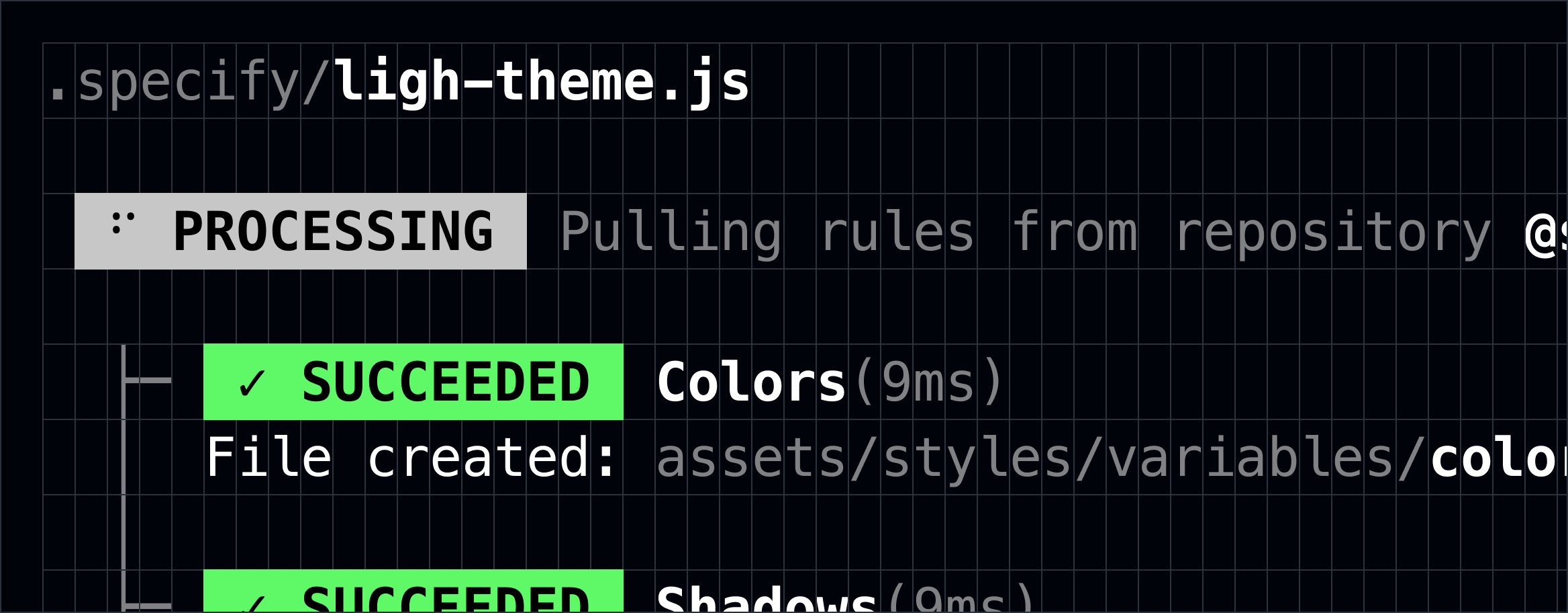
Similar to colors, users can override both font choices and font parameters (font size, leading, kerning, etc.). As a rule of thumb, I used a monospace font to have the most representative idea of the final interface.
The only thing you can control is proportion. So I paid a lot of attention to the spacing system applied and when to use bold vs. keeping a regular font weight — while keeping in mind that the final display behaves like an airport flight table with rows and columns and a fixed-size box.
Spacing
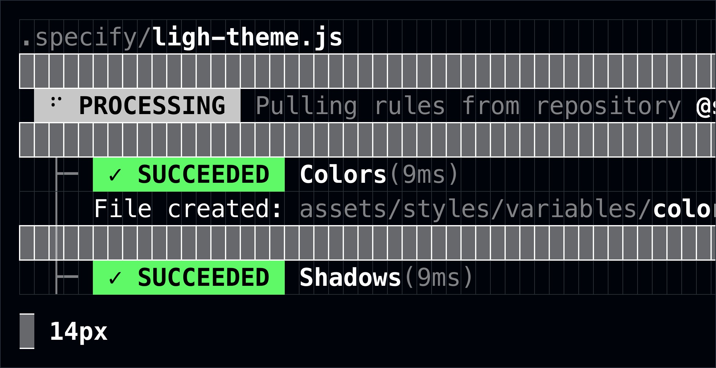
Horizontal spacings should use the width of a character (same for each character with a monospace font).
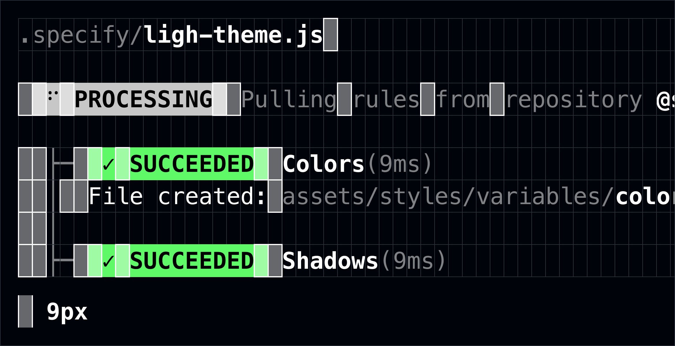
Vertical spacings should use the same height as a character’s line height (or leading).
Components
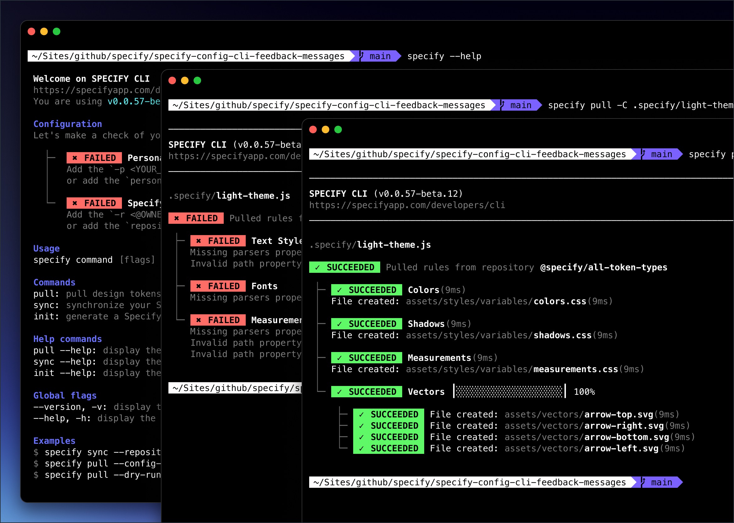
I created components and variants in Figma using Variants, and engineers replicated them in React.
To mimic the reality as far as possible in Figma, I created a set of Interactive Components for the header, progress bar, and processed rule.

As a result, we got 12 high-fidelity prototypes and iterated with engineers on successful extractions, error states, sync, help, new version, trial end, & missing payment.
See it live
Want to check out the final result? Here you go:
Outcomes
Key results we got a month after the release
+53%
Personal Access Token created to authenticate while pulling tokens from their Specify repositories.
+36%
Successful extractions — when a design token has been pulled from a Specify repository.
Credits
Thanks to this incredible team we exceeded expectations, S/O to them
Product Management
Maud Miguet
Design
Yann-Edern Gillet
3D + Motion
Thibaut Crepelle
Copywriting
Louis Chenais
Implementation
Nicolas André Mohamed Khalil Elloumi
API & Infrastructure
Antoine Moreaux Nicolas André
Read other case studies
Learn more about my work with this selection:


