When using Specify for the first time, users must to find the appropriate parsers while building their configuration to match their company standards while extracting design tokens.
Ultimately, chosen parsers should allow them to change the case (kebab, camel, snake, or pascal), transform color codes (HEX, HSL, HSB, LCH, Lab) and font parameters (px, rem, em), create different formats for fonts (otf, woff, woff2), and optimize assets before putting them in the correct folder.
Company
Specify
Period
May to June 2022
Space
Design Operations
Platforms
Web
Key Deliverables
Mockups, Prototypes, Animations, Code
+ 13,6%
average weekly new users
+ 14,7%
monthly usage of parsers
Opportunities
Here are the main opportunities we detected where the ratio reward/risk was balanced enough for this feature to be interesting for us to work on.
Improve activation
This feature was about helping developers get their job done and reach their Aha moment as fast as possible in their journey with Specify. We wanted to ease the discoverability of our Design API and its core concepts — configuration files, rules, and parsers.
Design work
How we managed to build this feature and achieved these results
Shaping
We identified three ways in which engineers can consume configuration templates:
From a public store: template gallery with details page with an output demo. Visitors will be able to copy/paste the configuration.
From our platform: when creating a new destination for a GitHub repository to distribute design tokens and assets.
From the command line interface: when engineers are starting a new project from scratch and need to use their design system.
We started with the public store, as one of our goals was also to improve our rank on search engines when users are looking to make design tokens working with SASS, CSS, Tailwind, etc.
Through trends and our top-used parsers analysis, we identified the top 5 most requested configuration templates on which we should prioritize our efforts:
CSS Custom Properties
SASS Variables
Style Dictionary for iOS & Android
Tailwind CSS
React & React Native
Building
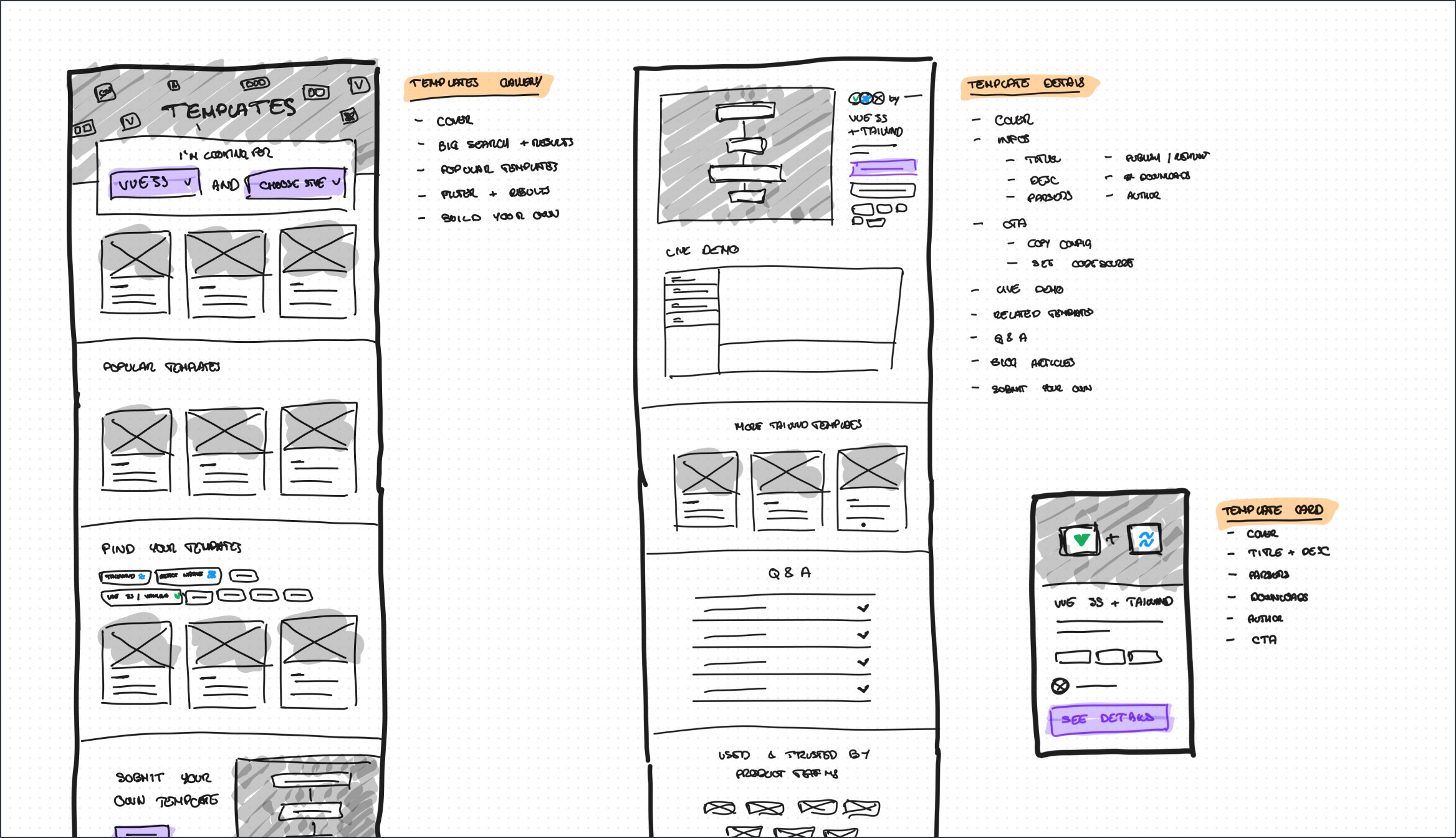
Sketches
While back-end developers were in charge of creating these configuration templates, I worked on the information architecture & layout of this project.
A dedicated gallery showcasing configuration templates and providing helpful content through Q&A, related articles, and our Design Data Platforms 101 Guide.
A details page for each config template lists parsers used, design tokens handled, config files with output preview, and additional resources.
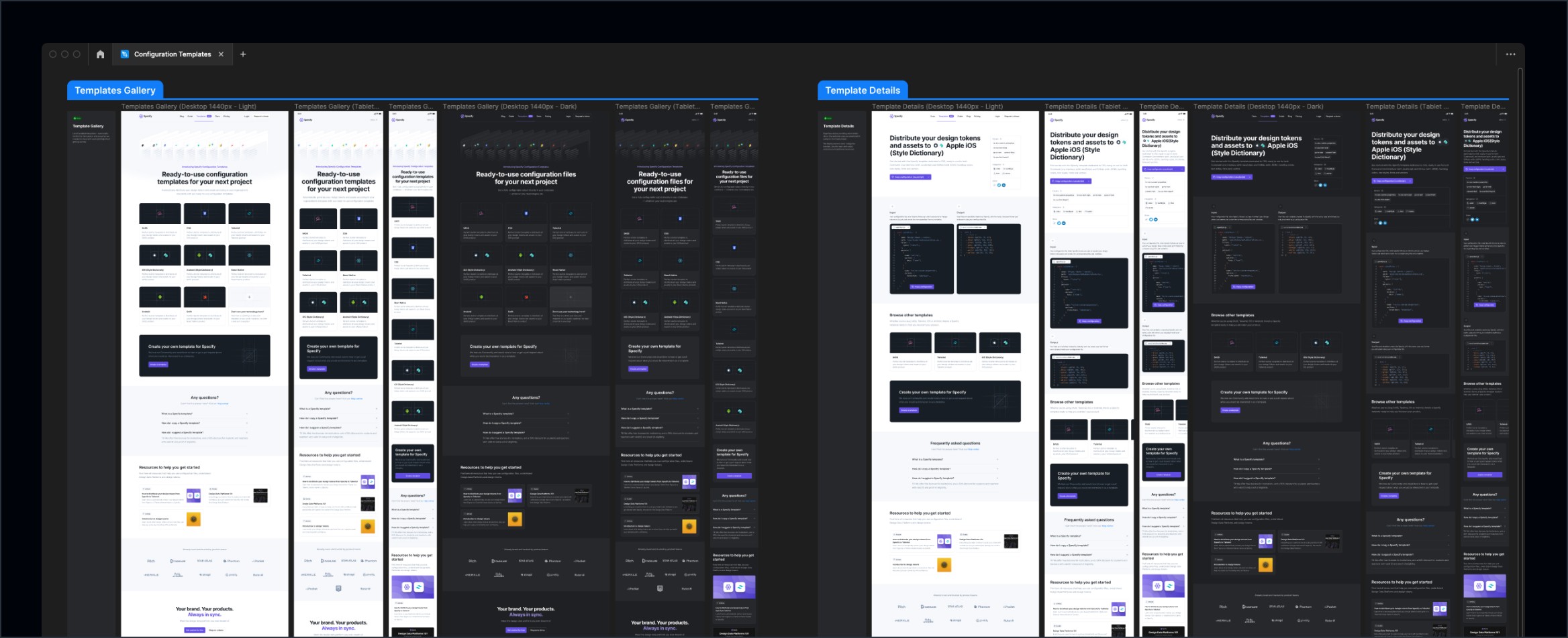
Final design
Then I worked on the final design, with light and dark themes and our three responsive breakpoints in mind, and spent some time exploring an animation for our gallery.
Hero
I ended up with this file card effect, reminiscent of a file cabinet drawer. I created it using Figma Variants and Interactive Components, the process is detailed here, and then I decided to code it to make sure it was possible. Codepen is available here. Then Nathanaël, one of our front-end engineers, optimized it and added it to production.
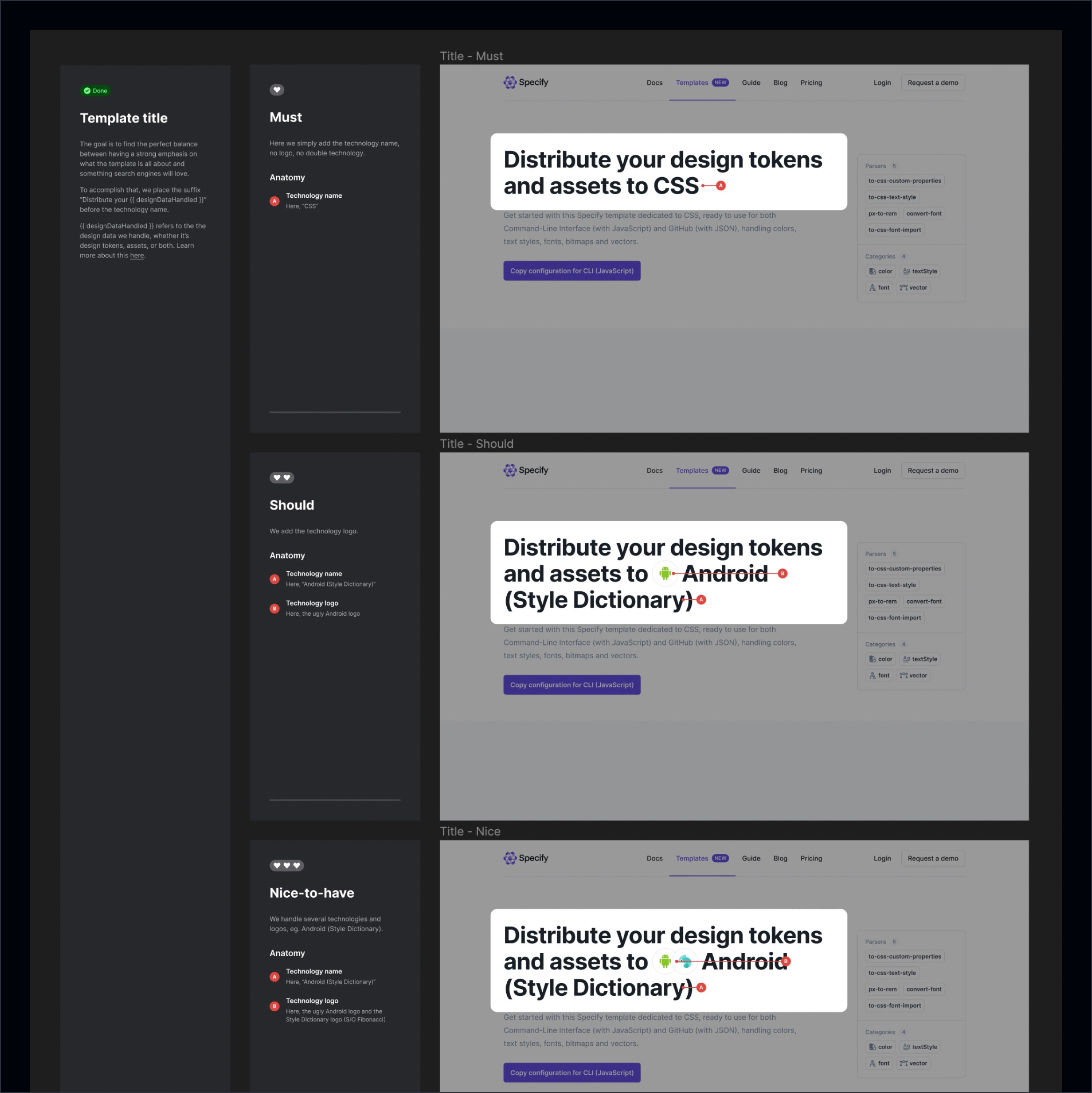
Prioritization
I also provided must-have, should-have, and nice-to-have versions with dedicated specs to help front-end developers deliver as regularly as possible through this 4-week cycle (1 week dedicated to shaping, 3 weeks devoted to building).
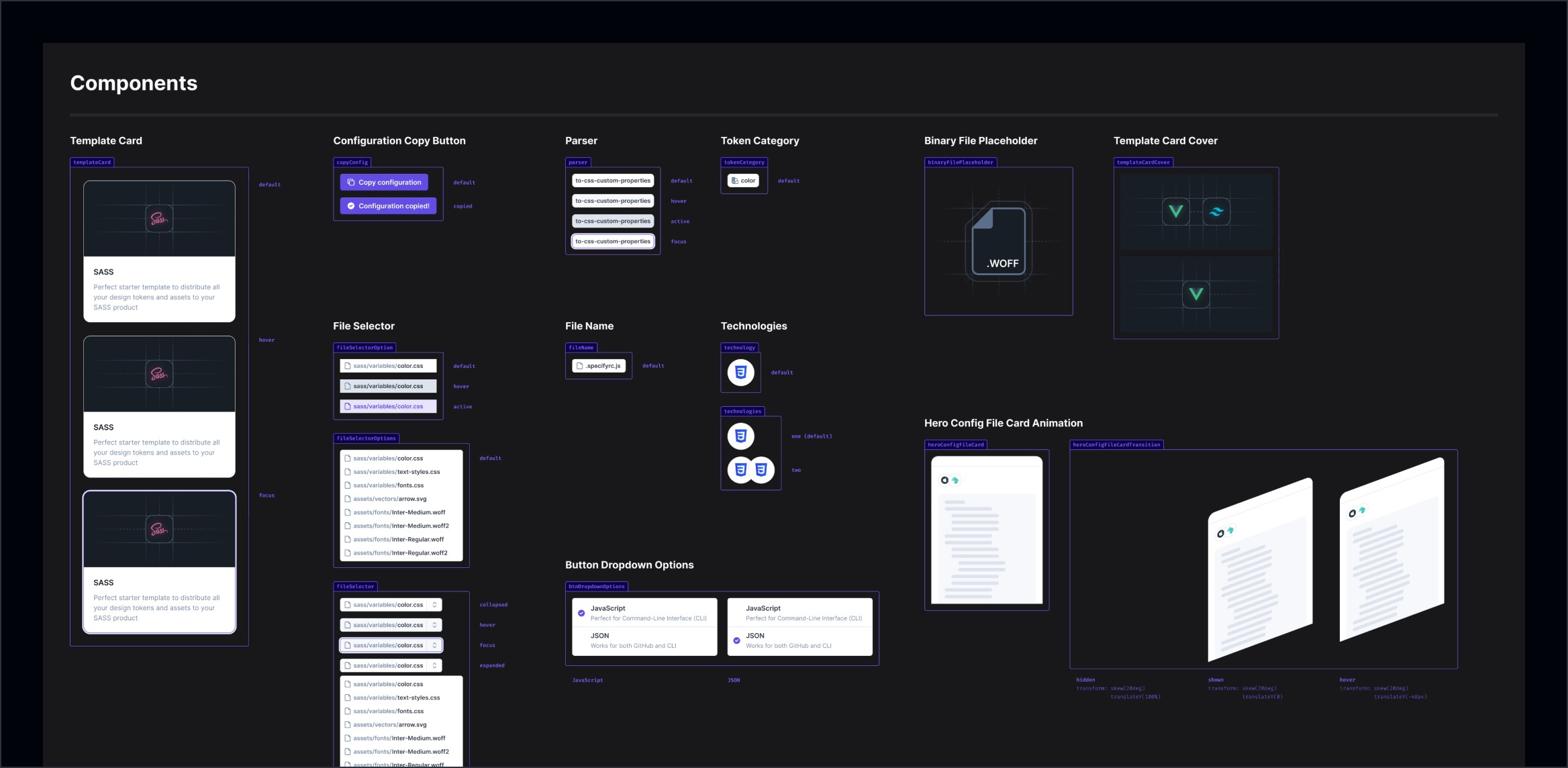
Components
I added and updated components within a dedicated page inside the Figma file.
Distribution
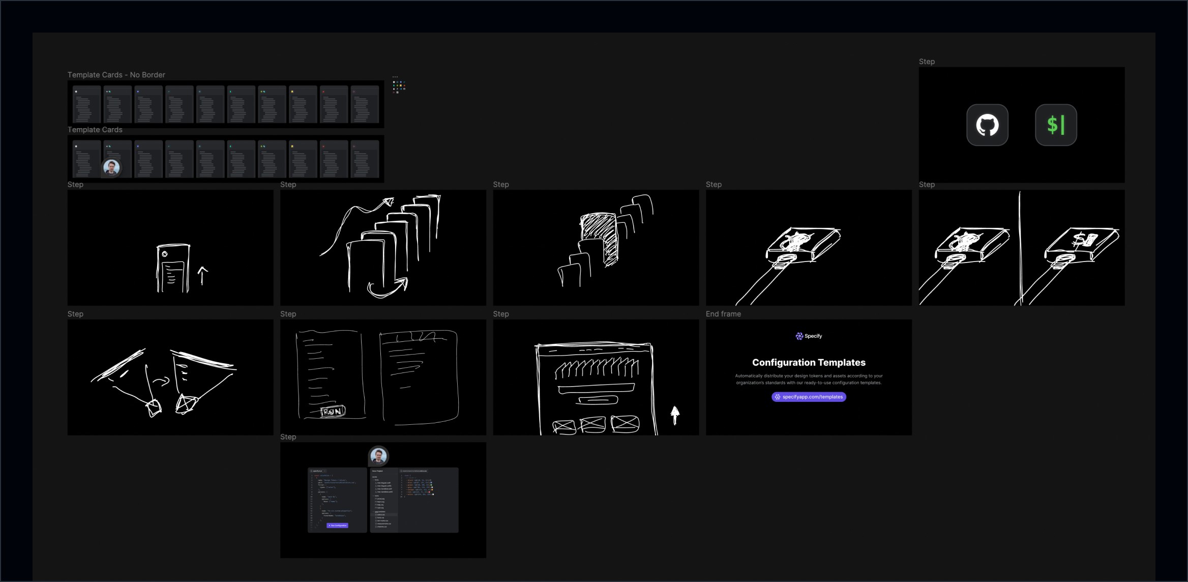
We re-formed our magical duo with Thibaut, 3D + Motion Designer @ Specify, to work on a short video to promote this new feature on Twitter, LinkedIn, and YouTube.
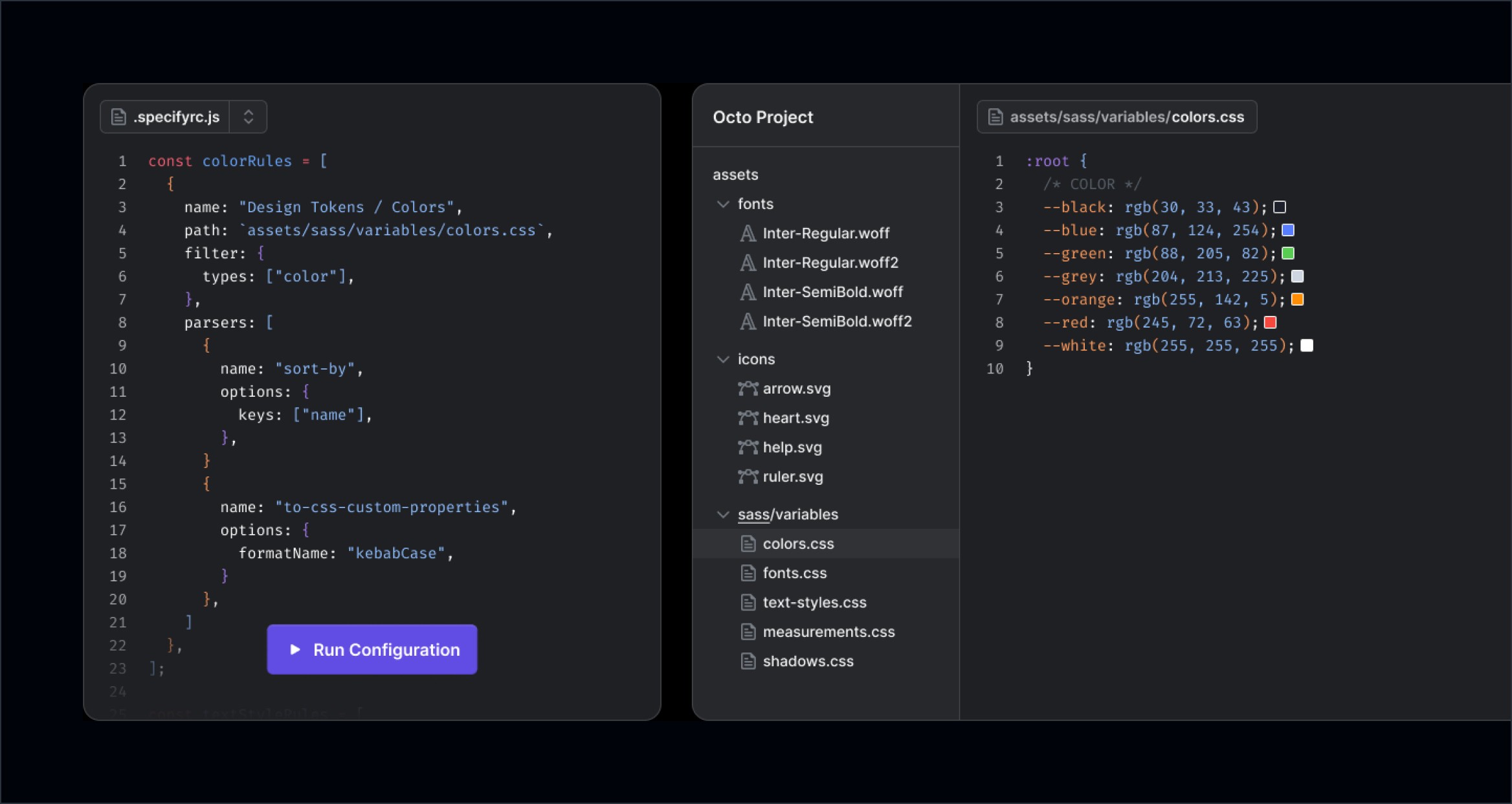
Through a 1-hour workshop, we created a storyboard and gathered visual references. I also designed high-fidelity visuals for Thibaut to help him save time.
See it live
Want to check out the final result? Here you go:
Outcomes
Key results we got a month after the release
+ 13,6%
average weekly new users
+ 14,7%
monthly usage of parsers
Credits
Thanks to this incredible team we exceeded expectations, S/O to them
Product Management
Maud Miguet
Design
Yann-Edern Gillet
3D + Motion
Thibaut Crepelle
Copywriting
Louis Chenais
Implementation
Allan Michay Nathanaël Labreuil
API & Infrastructure
Nicolas André
Read other case studies
Learn more about my work with this selection:


